A Case Study in User Satisfaction
Background
A multinational manufacturer came to VISTECH to enhance the usability and user-friendliness of its internal document management system. This web-based system serves as a repository for product information that scientific consultants use to prepare for in-person visits with healthcare professionals. The system’s ability to provide quick and reliable access to this content is seen as mission-critical for the business’s success. However, the company faced a challenging situation when employees reported a growing number of usability issues.
Challenge
Software User Interfaces need to be frequently updated, which is why VISTECH designs applications with tiers. These tiers separate the business logic, processing, and database access from the presentation tier. As a result, applications designed by VISTECH can easily adapt to changes driven by User Experience (UX).
VISTECH was engaged to complete an expert review process to identify the source of the reported User Interface (UI) issues and recommend solutions that improve efficiency and user satisfaction.
Solution
VISTECH successfully tackled this by first evaluating the website’s User Interface quality against a set of industry-recognized usability principles, also known as heuristics. The criteria used during this heuristic evaluation were first introduced in 1990 by Jacob Nielsen. Nielsen’s 10 principles have since emerged as the industry standard for evaluating usability and are regularly used by UX professionals, worldwide.
Two of the most significant areas of improvement that VISTECH identified from the heuristic review were:
User Control and Freedom
Users often perform actions by mistake. They need a clearly marked “emergency exit” to leave the unwanted action without an extended process.
- Violation: The depth of nested folder structures (folders located within another folder) in combination with page load speed may discourage users from exploring the system when considering the cost of traveling down the wrong path.
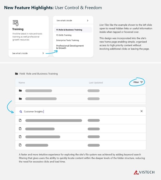
- Recommendation: Efficiency in accessing nested content can be improved by allowing the user to navigate the folder structure without leaving the current page. Where possible, the user should be able to preview sub-folder contents via a popover menu or collapsible accordion UI. Additionally introducing keyword search could help users quickly access content stored deeply in the structure.

Recognition Rather than Recall
Minimize the user’s memory load by making elements, actions, and options visible. The user should not have to remember information from one part of the interface to another. Information required to use the design (e.g., field labels or menu items) should be visible or easily retrievable when needed.
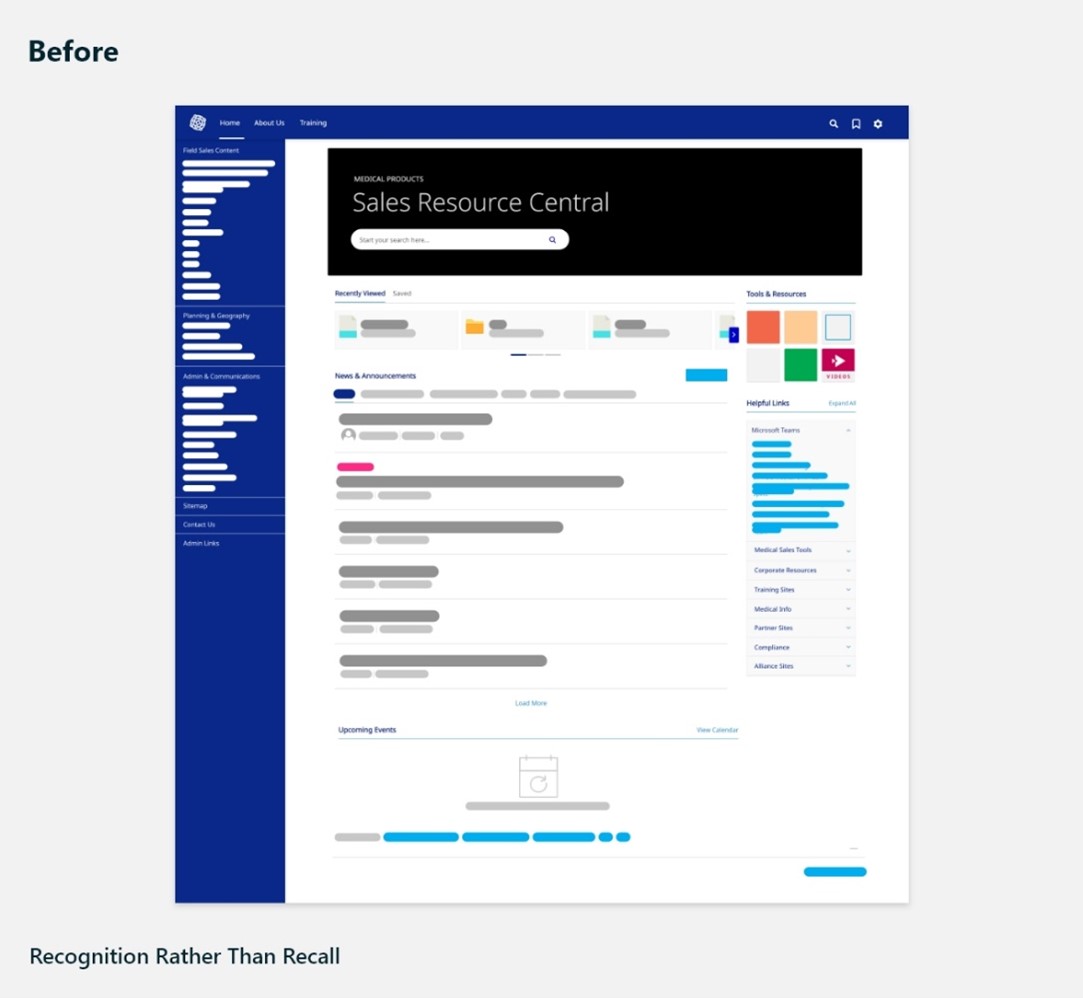
- Violation: The navigation menu on the left is text dense which requires users to take time to scan text each time. Link category headings and group dividers are not easy to process visually and provide low contrast. As a result, new users will likely not see this structure as a helpful way to explore how content is organized and may simply use the search.
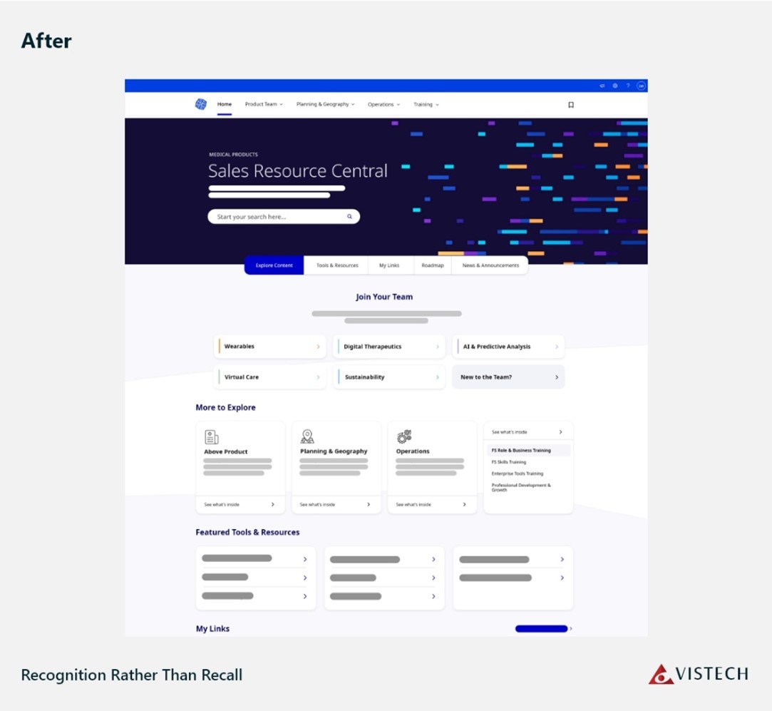
- Recommendation: Efforts should be made to utilize visual design and information architecture (IA) best practices that improve the scan-ability of navigation menus. A revised design may include a dropdown or pop-over menu system that limits the amount of visual information on the page to the area where the user’s attention is focused.


At the conclusion of the review, findings reported by our UX team were compiled into a report that included a score allocated for each area of improvement. The radar chart below provides an excellent visual overview of where the site requires improvement by mapping these scores over the 10 heuristic categories used during the evaluation.

Result
VISTECH‘s design and development teams worked closely with client stakeholders to collaborate on the selection of solutions recommended by our UX team. These solutions were chosen based on their potential to create the greatest impact and value, all while adhering to the project’s budget and timelines.
In this process, two notable areas of improvement emerged. Firstly, a comprehensive visual redesign of the system was undertaken, with a primary focus on streamlining the interface and incorporating the latest company brand standards. This redesign aimed to provide a fresh and cohesive look while maintaining user-friendliness.
Secondly, an enhanced interface was developed to facilitate seamless exploration of the site’s files and folder structure. This redesign aimed to deliver a faster and more intuitive experience for users. Additionally, a new keyword search filtering feature was incorporated into this tool, enabling users to quickly locate content within the deeper levels of the folder system and reducing the need for excessive clicks.
At VISTECH, we understand the importance of putting our customers first and providing them with the best possible experience. By leveraging our UX expertise and applying a comprehensive heuristic framework, we were able to identify and address usability concerns, leading to improved user engagement and higher conversion rates.
Take the first step towards an exceptional user experience and reach out to VISTECH today! Our heuristic review can uncover hidden opportunities and resolve any usability issues in your digital product. Elevate customer satisfaction, drive tangible results, and stay ahead of the competition. Don’t miss out! Contact us now to optimize your digital presence and deliver an outstanding user experience!
Read about VISTECH getting recognized as a leader among Azure solutions providers HERE!
Let's get in touch
Our goal is to be all about you. We understand the technology, but that’s not as important as understanding you and your business. We’ll deliver technology solutions that are the best…for you.
